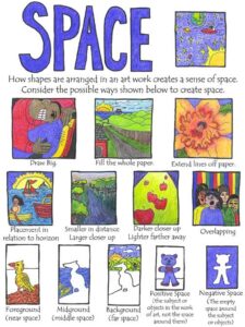
** My oldest has started high school courses! For art, we’ve chosen ARTistic Pursuits. The first lesson is on the use of space in art. Here are some resources I’ve found online to supplement the course. Enjoy. **
The passive space in a piece of art is important. Without it, the eye would have no where to rest from all the activity in the piece. But space is just as important in webdesign and everything else. So the information I’ve complied deals with all sorts of different types of design, but it will all be useful to understanding space as an artistic element better.

There is an interesting article about the use of space in typography and printing over at Treehouse Blog. VanseoDesign has a great article on the use of space in web design, and really activating the whitespace within your site. Follow that up with a neat article about the use of whitespace in web and advertising design over at A List Apart. I really liked the way he demonstrated how just a little judicious use of whitespace/passive space in advertising material can change the entire feel of the ad from cheap to upscale.
Joey over at the Daily Digi has a nice article about using whitespace in scrapbook layout design. This is right up my alley considering my background in digital scrapbook design.
Over at Sophia.org, Lucy Lamp has a very well done, comprehensive article that includes the different types of space found in artwork. I almost feel like the article has more relevance to perspective than space, but it gave me alot to think about.
There are a few good articles about using space in photography, at Digital Photo Secrets and PictureCorrect. In fact, if you Google “Space in photography” you will find several good articles and tips about the use of active vs dead space and the Rule of Thirds.
And of course, no discussion of space in art would be complete without talking about negative space and optical illusions. There is a good list of 25 over at Creative Bloq. Word of warning, once you’ve seen the arrow in the FedEx logo, it cannot be unseen!

